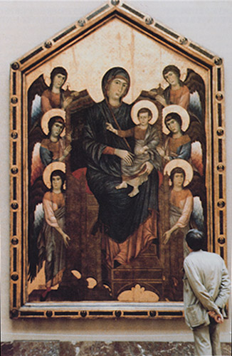
CIMABUE’S GOLD
Catalogue Essay by I. M. Tamplin

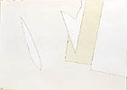
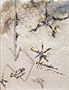
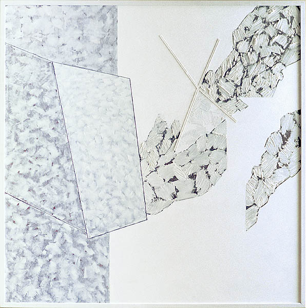
Feb. 29 1988, #III, oil on masonite, Diptych 2x-183x122cm
National Capitol Commission (reproduced in the catalogue)
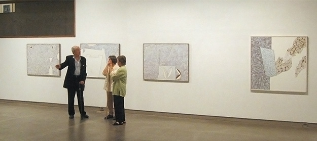
As Ron Bloore’s 80th birthday was approaching on May 29,2005, we wanted to celebrate this event with an exhibition that would take place in this year. When an artist reaches this age, the first thought is to do something retrospective. That would have been difficult considering Bloore’s distinguished and productive painting career and the modest size of our art gallery. However, after a visit to the painter’s studio in the fall of 2004, the selection of work for this exhibition was easily decided. An impressive array of brand new work stood against his studio walls and I knew right away that this exhibition would centre on Bloore’s most recent cycle of paintings.
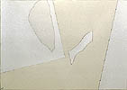
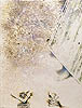
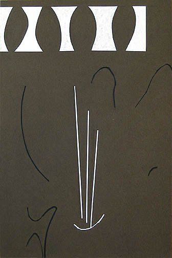
March 12 1988, oil on masonite, 224x122cm
Reproduced in the catalogue
Bloore is well known for his carefully crafted white on white paintings. He has usually not given them
titles
except for the most recent series of works which he named the
Dark Chocolate Series
because the surfaces of the paintings are predominately dark brown, the colour of masonite.
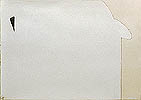
Sept. 9-15 1991, No. 6, oil on masonite, 122x122cm
Art Gallery of Peterborough Permanent Collection
Before we take a closer look at this new work, it should be noted that Bloore has been painting with oil on masonite since the 1950s. All through his career, he has preferred a rigid surface to the more flexible one of a stretched canvas. Although masonite has been his chosen painting ground, Bloore until now has only intermittently given its surface such prominence.

July 25-29 1998, Blue Series No. 1, oil on masonite, 91x122cm
Donated by the artist to the AGP Permanent Collection
A most interesting and comprehensive text by Terrence Heath describes Bloore as painter, art galley director and professor of art history in the catalogue
Ronald L. Bloore: Not Without Design,
1993, published by the Mackenzie Art Gallery in Regina [and on this site
here].
Looking back through the history of Bloore’s work, there are examples where raw masonite does play a significant role. Illustrated in this catalogue is
Painting No. 1,
1959, Mackenzie Art Gallery, University of Regina Collection. which is made up of oil paint on black masonite. It is one of the earliest examples in which Bloore carefully constructed the surface with white oil paint and then scraped away some areas of paint to reveal the dark surface underneath. The overall effect of diagonal lines made with ridges of white paint alongside more translucent scrapes, sets up a visually animated and subtly varied surface.

Aug. 20-26 1998, Blue Series No. 4, oil on masonite,91x122cm
Theodore Allen Heinrich, one of Bloore’s colleagues at York University. in an article in artscanada, March/April 1977 referring to an exhibition entitled R. L. Bloore: New Byzantine Lights and Other Paintings, 1960-1976. draws our attention to an unusual painting from
1974, named
The Unfinished Painting.
Heinrich saw it as the exhibition’s most arresting element and called this painting ‘the King Charles’ Head of the show’. He describes how Bloore covered half of the painting with white and left the other half of the raw masonite ground exposed, seen through a net of star-shaped lines painted in blue. green and white. Heinrich refers to these shapes defined with lines of colour as ‘presences’. Again, this work reveals not only something about Bloore’s painting technique but also hints at the intricate aesthetic relationship, which he continues to forge between the dark surface of the masonite and the visual impact of various thicknesses of paint layered on its surface.

Aug. 26 - Sept. 11 1998, Blue Series No. 5, oil on masonite, 91x122cm
Reproduced in the catalogue, and donated by the artist to the AGP
In the current works, Bloore first makes a small
pencil drawing
to establish his compositional ideas. Then a chalk grid, later removed, is laid out on the masonite and the elements
from the drawing
are crafted in-oil on this ground. He builds up some of the forms with thick impastos much like the relief areas in the white on white paintings.

Aug. 10-17 1999, New Series No. 7, oil on masonite, 122x122cm
Reproduced in the catalogue, and donated by the artist to the AGP
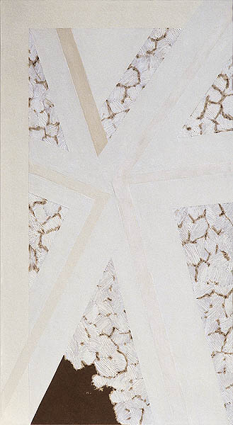
To put the most recent Dark Chocolate Series into context I chose for this exhibition some examples of paintings on masonite since 1988 including works with Bloore’s unique vocabulary of images which reveal many aspects of his process. There are stars, crosses, broken lines. circles and half circles, rays, nets, leaf forms and many other visual ‘presences’ that he has invented and carefully defined.

June 21 2003, No. 5, oil on masonite, 91x61cm
For example, the painting
Untitled: March 12 1988
is a monumental, upright composition superimposed with cross-shapes, rendered in several different whites. An unexpected exposed patch of masonite at the lower left comer of the work suggests a borderless space behind the painted forms. Terrence Heath, in the catalogue mentioned above, recognized that while Bloore establishes his usual codes in continuities and surface rendering, he also tends to break them by leaving areas of the raw masonite exposed.

July 5-16 2003, No. 6, oil on masonite, 91x61cm
Private Collection (reproduced in the catalogue)
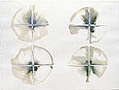
Untitled #III,
a diptych from February 1988 is a mirror image composition of crosses with a flat framing device on only three sides. The composition rising from the bottom of the panels appears as though there may be more below the frame that is not visible.

Oct. 21 - Nov. 4 2003, No. 16, oil on masonite, 183x122cm
Reproduced in the catalogue, and donated by the artist to the AGP
Similarly, the three panels from the
Blue Series, 1998,
drop the ‘horizon’ line to the very bottom edge of painting, but again it is not a real base line where the composition ends but more of a compositional device that suggests a continuity of forms which can be imagined in the space below the framing line. The crosshatched areas and translucent whites shimmer above the masonite ground, visually extending the imagery outward beyond the frame’s perimeter.
April 19 2004, DC No. 16, oil on masonite, 122x81cm
Reproduced in the catalogue
Gallery of Peterborough’s painting
Untitled, September 9-15, 1991,
shows several very different visual results derived from Bloore’s application of white paint and its reaction with the dark masonite. It displays the optical effect of a blue cast resulting from the thinly applied white paint on masonite, contrasted with the solidly painted white areas and the raw parts of masonite showing behind the agitated pattern of many dabs of white. The combination of such varied brushwork and the positioning of geometric shapes interwoven with free-flowing forms give the painting’s composition its depth and spatial interplay.

June 18-25 2004, DC No. 24, oil on masonite, 122x81cm
In Bloore’s
ink drawings
of the 1980’s, he delineates with resist techniques, white space within dark space and vice versa, always keeping an equal balance between them, since he maintains that there is no negative space in his work.
Untitled #7,
August 17, 1999 is a mostly white work with a square area of masonite in the upper left hand corner containing a leaf motif, similar to the black or white leaf forms in some of his
ink drawings.

Dec. 17-28 2004, DC No. 41, oil on masonite, 122x122cm
Donated by the artist to the AGP Permanent Collection
The dark, incised swirling lines in the panel
Untitled #16,
November 4, 2003 reflect back to the white lines in the
dark ink drawings,
but here in reverse since the incisions in the paint reveal the dark masonite surface. Thus, the ink drawings can also be seen as possible precursors for the approach Bloore takes in the treatment of the recent paintings.

Nov. 28 - Jan. 6 2005, DC No. 40, oil on masonite, 122x122cm
Reproduced in the catalogue
In this brief overview, it is evident that the new Dark Chocolate Series has evolved out of Bloore’s long working relationship with the material. However, there are at least three other factors about these works that I would like to address. The first is Bloore’s special regard for the Spanish painter Joan Miró, the second is the concept of ‘constellating’ and the third is Cimabue’s use of gold.

Feb. 9-24 2005, DC No. 44, oil on masonite, 122x122cm
Later donated to the Beaverbrook Museum, New Brunswick
Bloore once told me that when Miró came out of the hospital after an illness, he sent him a telegram that said simply
“Bravo Miró”. Earlier, Bloore had written: “The last great painter of the Western World was Cimabue... until Miró.” (Heath in the 1993 Regina catalogue, pg.69). Before that, Miró had expressed the view that, “All art after neolithic art is decadent”. What Miró and Bloore were referring to was the development of perspective during the Renaissance, which led to Illusionism in painting. Illusionism was seen as progressive by the generations of artists that followed until we come to the 20th century when artists began to recognize the merits of works from non-western cultures and like them, created artworks that were successful without Illusionism and hierarchical compositions. From the very beginning of his career, Bloore has admired and studied the art of other cultures and has organized his paintings in a non-hierarchical manner.

March 13-28 2005, DC No. 47, oil on masonite, 122x122cm
Reproduced on the cover of the catalogue etc.
Bloore admires Miró’s craftsmanship, which is not unlike his own. His recent cycle of paintings echoes
Miró’s painting cycle of 1936, also painted on raw brown masonite. In a catalogue of the exhibition Joan Miró, by curator Carolyn Lanchner, Museum of Modern Art, New York, 1993, she says, “...the masonite pictures are the clearest manifestation of Miró’s fascination with materials and the objectness of painting.” and “The effort is at its most concentrated in the masonite panels where a raw. almost ugly assertiveness of handling and materials makes an immediate impact that, more often than not, subsequently forces a deeper scrutiny” (pg.66). A very similar kind of assertiveness in Bloore’s handling of the Dark Chocolate Series definitely elicits our attention.

May 20-29 2005, No. 1, oil on masonite, 122x122cm
Reproduced in the catalogue, and donated by the artist to the AGP
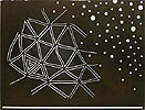
In several essays on Bloore’s work. writers have likened his use of pictorial space to a kind of cosmic space. I also did this when I included his work in the 1982 exhibition L’Etoile Noire, named after a painting by Paul-Emile Borduas. Since then, I found a passage by the Spanish sculptor Julio Gonzalez that says; “In the unrest of the night the stars are to us points of hope in the skies. These points in infinity have been the forerunners of the new art: Signs in Space.” (From the notes left by Julio Gonzalez in Leon Degand, Gonzalez, 1959, Universe Sculpture Series).


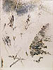
August 3rd and 8th 1979, both: oil, ink, pencil on paper, 36x51cm,
from the collection, hung outside the show
This passage is again referenced by Rosalind Krauss in The Originality of the Avant-Garde and Other Modernist Myths: first published in 1985. She notes that in 1932, Julio Gonzalez reflected on the ancient practice of configuring the constellations. Krauss says; “To draw with the stars is to constellate, which means to employ technique that is neither mimetic nor abstract.” She then quotes the same passage by Gonzalez although the translation is a bit different: “In the restlessness of the night, the stars mark out points of hope in the sky .. . It is these points in the infinite which are the precursors of this new art: To draw in space.”


Aug. 6 1979 and July 2 1978, oil, ink, pencil on paper, 36x51cm
From the collection. The first hung outside the show.
Miró also drew ‘in space’ in his
Constellation series of paintings of 1940/41 of which Lanchner says; “Nowhere else do the aerial and the earthly, the familiar and the cosmic, so seamlessly interweave.” In his painting career, Bloore has also been true to the new art through the forms he draws and paints in his particular pictorial space and the thoughtful placing of his ‘signs’ within that space. This compositional treatment is brilliantly revealed in the most recent painting in the exhibition,
Untitled, July 29, 2005.

1985, ink on paper, 58x78cm
From the collection, hung outside the show
As for
Cimabue, he was an Italian painter (active c. 1272- 1302) who depicted his religious figures against a solid gold background as was customary in pre- Renaissance times. In 1980, Bloore gave a lecture about “Giotto’s Error”. Giotto, an Italian painter (active c. 1300- 1337) who was thought to be Cimabue’s apprentice, also painted religious subjects, but according to Bloore, made the error of painting his sky blue and thus initiated Illusionism in painting.


Three inkworks on Fabriano paper from 1985-86, 78x58cm
from the collection, hung outside the show
Terrence Heath saw Bloore’s white on white paintings as a return to a kind of ‘ground zero’. I see Bloore’s most recent cycle of exposed masonite paintings as his true ground zero. At age 80 in this 21 st century, Bloore has found Cimabue’s gold in the neutral expanse of the brown masonite surface where his scintillating iconic forms are given the space to ‘constellate’.
-
Illi-Maria Tamplin, 2005


July 2 and July 12, 1983, ink on paper, 36x51cm
From the collection, hung outside the show
1969, oil on masonite, 91x91cm
From the collection, hung outside the show