↑ ↓ ↑ ↓
Lochhead and Bloore
at the Wallace Galleries
September '21
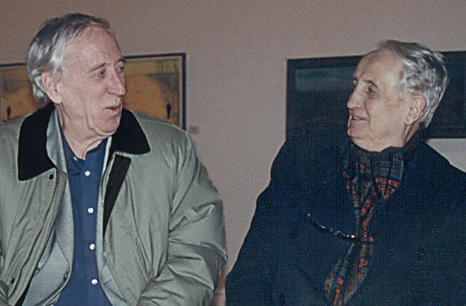
Ken and Ron in Toronto in 2000
Here they are together Kenneth Lochhead (1926 – 2006) and Ronald Bloore (1925 – 2009) after all these years. They've gone from young hot shot trail blazers to established and influential voices to pillars of art history. What do their works have in common? In what ways do they differ? What did they themselves have in common? And how did they differ?
↑ ↓ ↑ ↓

They were both born in late May, but they were born a year apart, both in Ontario, but Ken in Ottawa, Ron near Toronto. They both pursued dual careers painting and teaching and their careers intersected geographically more than once but their approaches to, their opinions on, their attitudes toward, their every sentiment and idea regarding both painting and teaching could not have been more opposite. They would both insist that that last statement is not true at all and they would both admit privately that it is in fact quite true. Ken would call it a difference of personality, Ron, a difference of understanding.
↑ ↓ ↑ ↓
The Bloores
 |
 |
 |
 |
 |
 |
") |
") |
") |
 |
 |
 |
") |
 |
|
 |
 |
 |
") |
|
These thumbnails link to images down the page which link to high resolution versions
The two became colleagues and lifelong friends in Regina around 1958 at Regina College in very eventful times, times fraught with tumult, some that is controversial to this day and when it came to visual art these two were at the two eyes of that hurricane. Insofar as any issue had two sides these two friends tended to be, temperamentally at least, on opposing sides while fighting ideologically for the same side. Bloore touches on some of this in the fascinating, though somewhat disjoint, interview with Joan Murray from 1978.
↑ ↓ ↑ ↓
The Lochheads
 |
 |
 |
 |
 |
 |
 |
 |
 |
 |
 |
 |
 |
 |
 |
 |
 |
 |
 |
 |
The four images above which light up red sold at the show and are down the page.
All the images are on the Lochhead page of
the Wallace Galleries website.
Ken was by nature an entertainer and an appeaser and Ron was by nature intentionally obscure and a provocateur. Ken was always wanting to give pleasure and reassurance and wanting to get them also, while Ron wanted to stimulate and to challenge and was always looking to be surprised. But the two always had the utmost respect for each other's gifts and commitment as is beautifully displayed in Ken's interview at the opening of the big Bloore Retrospective in Regina in 1991.
↑ ↓ ↑ ↓
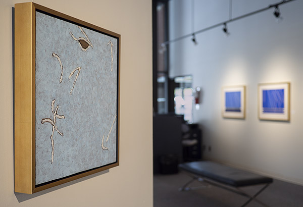
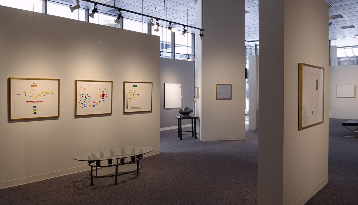
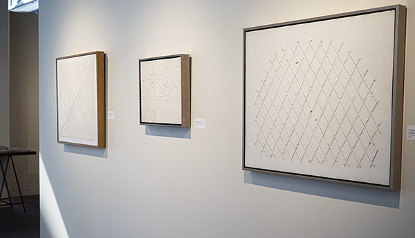
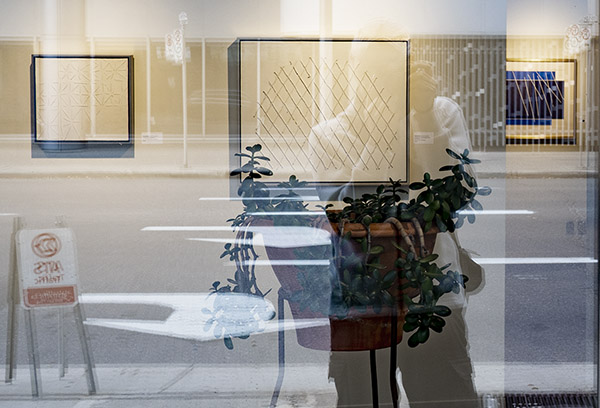
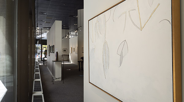
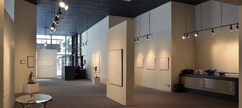
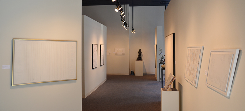
Show Shots
 |
 |
 |
 |
|
|
 |
 |
 |
Ken was a figure skater and he painted like one. The flexibility of canvas and brushes perfectly suited his own flexibility of movement and his flexibility of spirit, feeling and intellect. Bloore on the other hand, metal tool in hand, liked to build with his paint like a bricklayer does with bricks. Oil paint is his mortar and oil paint is his stone. When he tried to work on stretched canvas the corner of his scraper blade poked right through.
Click any Bloore below
to see it large in a separate window.
↑ ↓ ↑ ↓
1960, While Line Painting, 41x41cm, oil on canvas-covered masonite
Also hung in the
Bloore Centenary show of 2025.
Bloore's second use of canvas was smaller and this time he stretched and glued it over a panel. It went beautifully, but no thanks to the canvas material itself and he never used canvas again. Having switched from stovepipe enamel to oil paint the focus was now on the lines: the feel and the rhythm of the lines.
↑ ↓ ↑ ↓

1965, Painting, 61x61cm, oil on masonite
By 1965 Bloore's attention shifted from the sculpting of his lines to the sculpting of his fields. Illusionistic space was still eschewed for the sake of immediacy: there is no there there. The there that is there is here, tangibly present.
↑ ↓ ↑ ↓
August 25, 1976, Byzantine Lights, 61x72cm, oil on masonite
In the mid-seventies line and field, rhythm and rest, started giving way to composition as the works' main attraction. And composition brought with it spatial effects. These were concerns of the art of those years. They can be seen running through the Lochhead abstractions as well, in Yellow Head (1962), Green Hero (1964) and Upper Blue Portion (1967).
↑ ↓ ↑ ↓

May 9, 1976, Byzantine Lights Series Sketch, 46x61cm, oil on paper
This is the only known work on paper from between 1968 and '78. It is easy to see reasons why this unique caprice was saved. Harder to see why it was painted - perhaps just an exceedingly good mood. One would expect Lochhead to approve, if he ever had a chance to see it. Still, the closer you get (click to see larger), the more you see the pencil lines, the less gestural it is.
↑ ↓ ↑ ↓
May 20, 1976, Byzantine Lights Series Sketches, 46x61cm, ink and oil on paper
Kicking around concepts for Byzantine Lights Series paintings was a constant preoccupation of Bloore in 1975 and '76. There are four examples in the Tamplin Collection of the Art Gallery of Peterborough of very loose sketches on very ordinary paper. In the work above it seems even heavy art paper and oil paint could not fully attenuate the humour of that day's mood. There is one other page like it from a different day in the estate.
↑ ↓ ↑ ↓
March 2, 1980, 56x76cm, ink, gouache and oil on paper
Also hung in the
Bloore Centenary show of 2025.
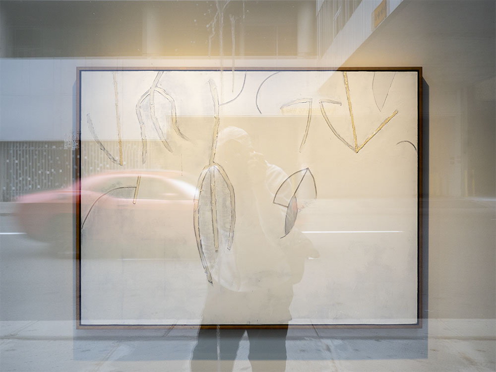
There is a spirit of Surrealism infusing all Canadian art. It can be seen immediately in the landscapes, in the space. Something between the figure and the ground is haunting the space. In his lectures Bloore always emphasized the role of space in art, emphasized that it is a religious role, an essential one. We must engage art as a mystery, a puzzle of the same order as we ourselves: one that we are qualified by our very nature to solve creatively. In Bloore's mixed media paper works of 1980 the extraordinarily lively figures which do not really resemble any living thing thrive in a very surrealistic space. Meanwhile Lochhead's inhabited landscapes and portraits in elaborate settings like Lady Waiting (2003) and Virgil (1985) are very deep, and the layers of space between us and the far distance are not flat, not flat at all.
↑ ↓ ↑ ↓

July 1981, Magius Series, 46x61cm, gouache on paper (SOLD)
Lochhead would often achieve a sense of space with intensity of colour. In Bloore's four gouache on paper works from the 1981 Magius Series he devoted large expanses of paper to unmodulated, sometimes a little mottled, intensely coloured paint. Lochhead does the same in Virgil (1985) and The Dean (1985) and the flatness of the paint does not read as flatness of space.
↑ ↓ ↑ ↓

July 1981, Magius Series, 46x61cm, gouache on paper (SOLD)
In contrast to Lochhead's Colour Nine (1966) and his own early white-on-whites Bloore keeps the geometry very rigid in this series. He templated and (almost) mechanically repeated part of the composition and varied the works' perimeter shapes instead. As with all the works on paper these are very experimental.
↑ ↓ ↑ ↓

July 1981, Magius Series, 46x61cm, gouache on paper (SOLD)
The experimentation with perimeter shape begun with the Magius Series lead ultimately to the Monumental Series of the mid-eighties particularly, one might say, the shape of the Magius drawing above.
↑ ↓ ↑ ↓

July 1981, Magius Series, 46x61cm, gouache on paper
Also hung in the
Bloore Centenary show of 2025.
Magius Series works hang well in groups, highlighting the repetition, but they sell separating-ly. A good example is the Scythian Stag Sequence three out of the four of which hung in the Gallery Lambton show of 2002. Two are in public galleries, one is in private hands and one is still in the estate.
↑ ↓ ↑ ↓
1997, Brushed Line Series Sketch No.1, 31x41cm, oil on masonite
In 1992, inspired by the Seurat retrospective in the Grand Palais in Paris which Ron saw with his wife Dorothy Cameron, Bloore tried using brushes in various ways to activate his fields. This worked splendidly well but was tediously laborious for large areas. In 1997 he pulled out the brushes again and tried building his lines with them.
↑ ↓ ↑ ↓
1997, Brushed Line Series Sketch No.2, 31x61cm, oil on masonite
Ron commented at the time how appealing and seductive the brushes were, how sexy they felt, soft in a way that felt strong, how they encouraged expression with their immediacy, and how this all had to be brought under control.
↑ ↓ ↑ ↓
Feb. 8, 1998, Painting No.30, 61x81cm, oil on masonite (SOLD)
Getting the new line work under control was done on small panels: improvisational sketches at first and then preconceived compositions in a wide range of sizes. Most of the small works sold quickly, mostly to painters.
↑ ↓ ↑ ↓
March 2, 1998, Painting No.32, 91x122cm, oil on masonite
As Bloore mastered the techniques of brushed line work that served his particular purposes and the paintings got bigger, they began to look more and more like the previous series. The last few, however, were radical efforts as the ends of series usually are. In this painting the tape masked lines are making their reappearance. And then came the Blue Series.
↑ ↓ ↑ ↓
March 1, 2000, Painting No.16, 91x91cm, oil on masonite
After the brushed blue fields of the Blue Series Bloore's lines became decidedly more curvy, more ebullient, less curious, as effective as ever, without being expressive, not too “emotionally derived.”
↑ ↓ ↑ ↓
May 23, 2000, Painting No.19, 84x91cm, oil on masonite
Also hung in the
Bloore Centenary show of 2025.
In this work as in the entire Blue Series there is no blue paint. All the paints are “white artist's oils”. The effect of some backgrounds of Bloores being bluer is an accident of chemistry. Only scraping certain formulations of white paints very thinly onto dark brown masonite produces the effect. Bloore's golden fields and lines are also white paints, in their case simply cured away from light.
↑ ↓ ↑ ↓
July 23, 2003, Painting No.8, 84x122cm, oil on masonite
In his interview about Ron in 1991 at the vast Bloore Retrospective Ken said, “the show is totally overwhelming. It's like all of Wagner at the same time; it's that kind of weight and intensity. One painting after another.” From 1991 on, though, as this show demonstrates, the weightiness definitely lightened, at least until the darkness of the Late Series descended behind his figures in 2004.
↑ ↓ ↑ ↓
April 2005, Painting No.3, 41x41cm, oil on masonite
SOLD in the
Bloore Centenary show of 2025.
In between the 2nd and 3rd Late Series came three little minty squares. Bloore had completely embraced colour in his recent painting on dark brown grounds. It was time for a few with colour as the grounds. These were light, a bit like Virgil (1985) but no, the next series would again be dark, we might say, like Diva (1987)
↑ ↓ ↑ ↓
The Lochheads
These images are on
the Lochhead page of the Wallace Galleries website.
Many more are and much more is on the
kennethlochhead.com website.
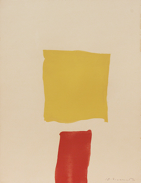
Yellow Head, 1962, watercolour, Ken Lochhead, 65x50cm, (SOLD)
Like the Bloore from 1965 this early Lochhead pushes much aesthetic complexity with little compositional complication.
↑ ↓ ↑ ↓
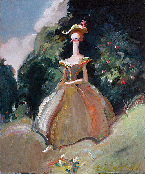
Lady Waiting, 2003, oil on panel, Ken Lochhead, 60x50cm, (SOLD)
Bloore once commented that darkness was sometimes the best thing in the occasional Lochhead. This lady is waiting for something, or will she be devoured by what lurks in the woods behind her? Perhaps she will be devoured by that for which she is waiting, or rescued. I worry for her. But I enjoy worrying for her.
↑ ↓ ↑ ↓
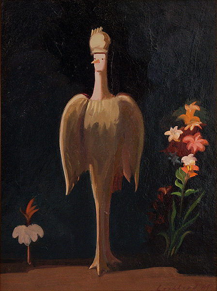
Diva, 1987, oil on panel, Ken Lochhead, 40x30cm, (SOLD)
Bloore famously knows his art history and revels in it. But Lochhead knows his western art history and it informs his works at every level.
↑ ↓ ↑ ↓
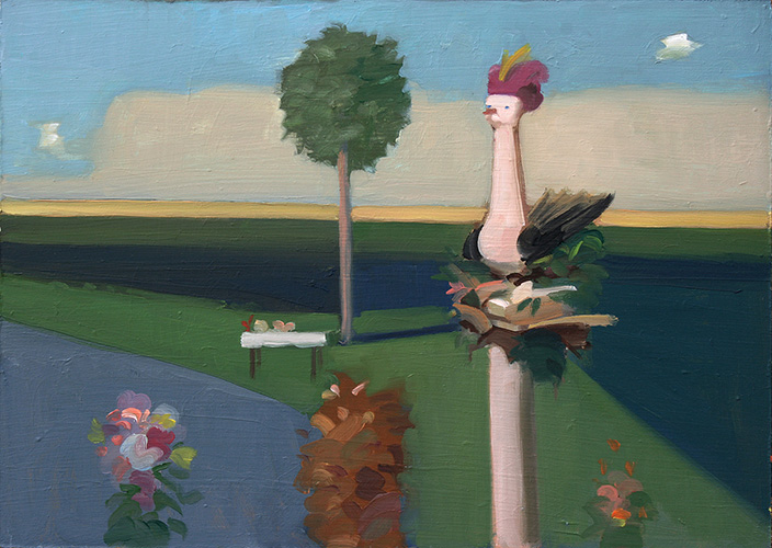
Virgil, 1985, oil on panel, Ken Lochhead, 25x35cm, (SOLD)
It can be said, and has been said, that the yellow line makes this painting. The foreground and middle grounds are bathed in the soft light of a lavender sunset. Meanwhile, in a wash of unreal brightness, the prairie in the background is bright as midday! This is surrealism Lochhead style circa 1985.
↑ ↓ ↑ ↓
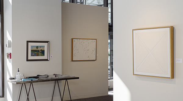
Show Shots
↑ ↓ ↑ ↓
click to see larger
↑ ↓ ↑ ↓
↑ ↓ ↑ ↓
↑ ↓ ↑ ↓
click to see larger
↑ ↓ ↑ ↓
↑ ↓ ↑ ↓
↑ ↓ ↑ ↓
↑ ↓ ↑ ↓
October 2016
 |
 |
Our 2016 show Ron Bloore, Untitled at the Wallace Galleries
↑ ↓ ↑ ↓
April 2011
 |
 |