| Contents | Other Articles | Work | Introduction | CV |
ART GALLERY OF PETERBOROUGH OCT.20 TO NOV.27 1988 R. L. BLOORE DRAWINGS 1960 - 1988Catalogue Essay and Forward by I. M. Tamplin[cf: Tamplin Collection Donation - Globe and Mail and: Complete Tamplin Collection Image Gallery] |
| FOREWORD In 1986, the Art Gallery of Peterborough presented an exhibition of current paintings, maquettes and drawings by Ronald Bloore. During the preparation for that exhibition, the artist showed me some early drawings beginning in 1960, and indicated that he had worked on large cycles of drawings in the 1980's. The link between these years intrigued me and I began to plan an exhibition that would deal with the drawings alone. At first, the earlier drawings were to be an introduction to the latest "leaf" cycle from 1986-87 which would be presented in the Main Gallery. But, as the research into the work progressed, it became evident that there were many threads that interconnected, from work to work and cycle to cycle. I have chosen several drawings from each series to allow for a more comprehensive overview. Whenever the cycle contained a large number of drawings, more examples have been included. At first, because of gallery space constraints, we were considering only complete or "formal" drawings for the exhibition. However, as I examined the "doodles" which Bloore makes on ordinary scraps of paper, the working drawings for major paintings and murals, even the postscripts reflecting back to maquettes or paintings, I felt that these were an essential part of the whole body of work. The exhibition was then expanded to allow for this insight into Bloore's working method. Illi-Maria Tamplin, Director INTRODUCTION "Art is a form of supremely delicate awareness... meaning atoneness, the state of being at one with the object..." -D.H. Lawrence
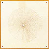
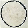
One might ask how a Canadian artist trained in Art and Archaeology, which then meant the study of mostly European art history and classical archaeology, would produce such a drawing. The American critic Clement Greenberg, who was sent to western Canada in 1962 by Canadian Art Magazine to report on painting and sculpture in the prairie provinces, found five "fired-up", "big attack" artists: Ron Bloore, Art McKay, Ted Godwin, Doug Morton and Kenneth Lochhead, known as the Regina Five. Greenberg recognized Bloore's leadership role as a teacher, gallery director and artist. He saw in Bloore's attitude a similarity with that of the French Canadian painter Paul-Emile Borduas: "By introducing Borduas' direction, Bloore warded off that of New York abstract painting in the fifties, with its mannered brush swipes... The influence of this New York manner has been one of the most blighting, as well as most infectious, that I know of in modem art. Borduas' influence may carry some Paris 'pastry' with it, which can be just as bad as New York 'lather', but Borduas' integrity seems somehow to have communicated itself to his influence, at least in Regina, and prevented it from having too deleterious an effect there." (Canadian Art, March/April 1963, pg. 92). I see the Borduas-Bloore alignment as one of kindred spirits rather than as a matter of influence. Both artists relate their work to the cosmos. One is reminded that Borduas received the Guggenheim prize in 1960, after his death, for his masterpiece painting L'etoile Noire, 1958. Both artists were obviously intrigued by early explorations of outer space. The term "l'etoile noire" later came to mean a "black hole" when this phenomenon was discovered by scientists. In 1956, Borduas named a painting Expansion Rayonnante. The choice and manner of execution of the rayed disc as a key image in the early drawings and paintings established Bloore's individuality, integrity and restraint.
In 1960, Bloore had not yet made these pilgrimages to major sites, but had knowledge of them through visits to museums and through books. Yet even the earliest drawings carry a spiritual presence. I find this spiritual reference to be inherent in the placement of parallel lines which is so very much in tune with the way people of primitive cultures drew them. An example that comes to mind is the incised parallel lines and concentric circles on carved objects belonging to the prehistoric Old Bering Sea culture found in Alaska. Since the objects are utilitarian, the lines serve as decoration, yet their sophistication is magic. The drawings of the 1960's are done with very exact lines, and the occasional use of coloured inks. There is never any softness or shading. The lines are placed so precisely that they feel as though they were incised rather than drawn on the paper. The space between these lines plays a very important role in the composition and affects the optical result. These spaces are manipulated to the extent that the same white paper background will assume different shades of white through retinal illusions. Once a motif such as a circle, half circle, star, rectangle or polygon is chosen, Bloore usually works many variations of that one motif within a particular drawing. This can then lead to the discovery of other motifs within the context of the primary motif chosen. Negative space surrounding the drawn forms is as important as it is to a sculptor. It filters through the shapes and balances them against the background of the clear paper. Within this working method of keeping a tight control of his means, Bloore maintains the essentials in these drawings without resorting to the reductive nature of 1960's Minimalist Art. The drawings reveal his path of discovery.
At a time when Bloore was placing distinct forms on paper, he was also creating drawings which considered the whole picture plane and traversed its entire space. One square joined another and then another, sometimes forming architectural and cybernetic assemblies. However, when the symmetry becomes too regular, Bloore breaks it by introducing slight, subtle irregularities in the drawing lines. In the "grid" paintings and drawings of 1964 and 1965, he prevents the boundaries of the squares from meeting at right angles, often leaving the comers open like a tom net. Bloore varies the value of the lines, demarcating the squares by gradually diluting the ink until it almost disappears. These shifts in value create in the "net" drawings the most shimmering, delicate surface imaginable. Again, the play of negative and positive space around the lines suggests other motifs. At certain intersections, stars are formed and at others, the cross is emphasized.
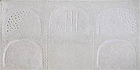
Following travels to Greece, Turkey, France and Spain in 1973, Bloore's "doodles" on the back of meeting agendas and other bits of office paper began to explore an arch-shaped motif containing a variety of inner structures and divisions. In the article "Ronald Bloore: new Byzantine Lights and other paintings" (artscanada, March/April 1977), Theodore Heinrich marvels at the inventiveness of the artist in the Byzantine Lights Series. He goes on to suggest that the flattened arch-shapes "look in fact like transmutations of small pierced Luristan horse-jingles in bronze, but Bloore recalls marble panels leaning haphazardly against the walls of the forecourt of the Byzantine Museum in Athens, panels of a purpose imperfectly known to him, but nagging as designs."
There are no formal drawings within the Byzantine Lights sequence, but I feel that these paintings form a definite link between the preparatory mural drawings for Dorval Airport of 1968 and the ink, oil and pencil on paper drawings of 1978-1979. There is one particular Dorval drawing, catalogue number 70, in which Bloore draws the basic components in ink on brown paper. He then adds white oil paint over much of the surface by applying a thinner coat of white to critical design areas and allowing the brown paper underneath to affect the colour of that area, leaving a faint indication of the lines and shapes underneath. In the drawing, catalogue number 71, he adds pencil notations of the many whites that will be used in the painting of the mural. The 1978-79 drawings are technically very close to the method of drawing the 1968 mural studies. First very dark ink lines, sometimes graphite lines, are drawn on the paper. Then, several different white oil paint washes are applied in the areas between the dark lines and are often gently brushed over these lines. Some of the Bloore motifs of crosses, triangles and arches underlie these compositions, and yet are of secondary importance here. Bloore seems to focus instead on the negative spaces between the motifs, letting them rather than the lines speak. As Theodore Heinrich recognizes in an article about this sequence of drawings, "Ronald Bloore: new directions", (artscanada, May/June 1979, pg. 56): "There are now surprising disharmonies of ectoplasmic curves and jagged angles engaged in dialogues variously of argument or restless movement." The lines in these drawings seem to enter the picture plane from every direction, often disappearing in an amorphous space of white. The use of the optical effects in juxtaposing certain whites was fully explored within the formal, classical structures of the Byzantine Lights paintings. Bloore's inventiveness needed to counteract that formality which resulted in these 1978-79 drawings. There is so much more confrontation between the shapes than ever before. Bloore lets the lines dance with joy in ritual abandon.
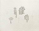
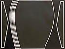
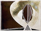
At the time of the Sumi ink drawings, Bloore also constructed wood figures painted black and white, which he named "Blooples". [These have all been eliminated by the artist. -H.R.] The figures are represented by stark geometric shapes. At first glance, they seem to have no gender, but through subtle opposition of narrow and wider lines, black and white, smaller and larger discs for eyes, they can be identified as male, female and child. The wood figures are three-dimensional as in a relief. When using them as subjects in the drawings, Bloore sometimes adds small sections of solid blue, red or green gouache, strategically placed to give the illusion of another spatial reference behind the figures. The reduction of means and the very basic geometrics of the figures give them the same totemic presence as those in the 1966 drawings. The minimal use of solid colours in the "Blooples" drawings led to the use of gouache in a series of works called the Magius Series, 1981. The drawing is done in the same fashion, using tape to mark the lines. The paper surface is covered with brilliant solid colours inspired by Spanish Mediaeval book illuminations. The white lines in combination with the intense colour area create a very active retinal response in the viewer. Bloore enhances this effect by making strategic cut-outs along the edge of the paper as shown in the Scythian Stag Sequence, catalogue number 29, or as square perforations within the majestic cross composition. There are several drawings in the Sumi inks of 1981 that are like catalogue pages recording an example of all the signs, forms and symbols that Bloore has ever used. Michael Brodzky, in the already quoted article, calls these drawings "a kind of Rosetta Stone or, more appropriately, like the Disk of Phaistos, a codex pregnant with visual significance but without any known verbal equivalent." Many of the images are the same as those found on the 1966 motif drawings, others have appeared as doodles on scraps of paper and some are elements taken directly from major paintings. Here, Bloore turns them into the main subject of his composition. Nearly all the ink drawings that follow in the 1980's will in some way refer back to these pivotal works. Bloore continued to use black Sumi ink in the 1982 series of drawings with some innovations. He begins to desolidify the black areas by diluting the ink until it changes naturally from black to brown. To complement this discovery, he occasionally experiments by adding a lighter brown walnut ink. In addition, Bloore sometimes leaves part of the paper blank, which makes white space instead of drawing white lines. The drawing lines become very intricate with great variance in the flow, thickness and length. An entirely new illusionistic depth enters these works. Since Bloore has searched for dozens of different white paints for his paintings, he has discovered a similar variety in black inks which, when diluted, release their inherent colours such as brown, blue, green and even yellow. In the early stages of using this technique, Bloore dilutes the ink only enough to show a solid velvety dark colour. As the experimentation progresses, he applies the inks in diluted form on wet paper achieving far greater translucency and purity of colour than would be possible with watercolour. The working method for these drawings is concentrated and spontaneous.
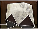
Not many drawings were made in 1984. But in 1985 Bloore utilizes many of the discoveries of 1983 and creates larger format drawings with complicated spatial relationships in the compositions. In contrast to these complex drawings, Bloore again takes a very basic form like a cross and surrounds it in a softly radiating disc as in the undated drawing of 1985, catalogue number 49. He feathers the delicately coloured ink away from the tape line, which gives the illusion that the shape of the cross is a whiter white than the rest of the paper. The optical glow that results enhances the spiritual in these drawings.
In 1987, Bloore also produced several constructions made of white paper and some colour. From these, his attention focused on large eight by eight foot paintings which he began after moving to his spacious new studio in the winter of this year. The working drawings for two of the major paintings are included in this exhibition as mesmerizing evidence of Bloore's most recent visual ideas. Illi-Maria Tamplin
[cf. also: |
| Top of Page | Contents | Other Articles | Work | CV |