↑ ↓ ↑ ↓
THE RON BLOORE INTERVIEW
Work Seen Magazine, Dec. 1990 — Jan.1991
On a wet November morning, I walked east from my Niagara Street studio to the other side of Spadina and my meeting with Ron Bloore. His spacious studio was lined with masonite panels, diptychs in various stages of completion. When I arrived, Bloore was reclining, reading Jack Pollock’s recent autobiography. He was immaculate in a pin-striped suit, not your average studio wear. For the next hour and a half, Ron Bloore spoke to me at length on a wide range of topics. The following are excerpts from that interview. - Eugene Knapik
↑ ↓ ↑ ↓
 |
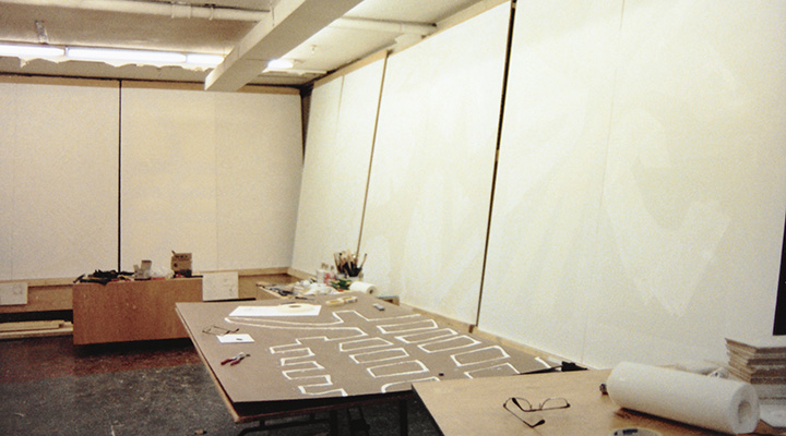 |
The first Adelaide St. studio in Jan.'89 (right) and Jan.'90 - before November's disappointments 1
A Sense of the Ghoulish
The whole studio was draped with these black party streamers: “which I got from Balloon Express. I’ve used them a lot.” The whole place, the paintings, were hung with these things. “I got a little fed up. It's a private joke, if you will. You know I’ve got a sense of the ghoulish. I go and pull up a gravestone and draw in Mt. Pleasant Cemetery, that sort of stuff. Here, I figured I’d had three rejections of my work on one week and I felt the paintings were feeling pretty sad about this so I better go and get some black crepe and give them this funereal thing. They’re ready for burial.”(1)
↑ ↓ ↑ ↓
 |

Knapik's two photos which accompanied the article |
Black and White
The paintings are in a sense calculated ahead of time as much as possible but they have to undergo fantastic changes in the process of execution, because I’m working from a little drawing, a little sketch in pencil. I'm currently working on eight-by-eight-foot paintings. A lot of changes happen.
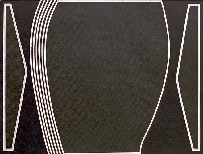
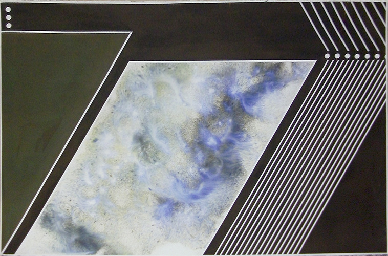
The ink drawings are totally different. I haven't made any of those for the last four or five years. They are a total reversal of the paintings, which are carefully calculated. I go into the studio, I stretch or hold down a piece of Arches or Fabriano paper on a board with masking tape and pick up a roll of stuff known as geo-tape. Architects use it. It comes anywhere from a sixty-fourth to a quarter inch in width. It’s quite flexible so you can pick it up, hold it down at one end and go whoosh in a great arc and you've got that piece of geo-tape stuck down there and that gives you a line. I would do this as rapidly as possible, without any preconceived image at all in my mind. I would not know how it was going to turn out. I could even put the first few down with my eyes shut just to make sure. The tape is put down as fast as possible.
I then have about four or five different black inks. These are European inks; the fifth one is a sumi ink, Chinese or Japanese, it doesn’t make much difference, which is pure black. The European, and I'm not certain about the North American, black inks are made out of two colours, blue and orange. The blue immediately sinks into the paper. The orange is a little slower; it tends to sit on top. So, OK. The “black” inks therefore are not black. They are a combination of those two colours. They vary in mixture with each company. Some, if treated properly will give me a peculiar sort of greenish tinge. If I'm lucky I'll get it after about three or four coats of ink. Another one will give me a purplish colour with sparkle on it, absolutely marvellous. If you blot properly, maybe put the stuff onto wet paper, float it on, and then blot quickly, you get all the orange off and you've got this great, marvellous blue.
↑ ↓ ↑ ↓
 |
 |
(left)1982, August 5, 46x61cm, ink and sumi ink on paper, Private Collection
(the sumi ink is at the sides and in the centre, Click to see
Larger)
(right) 1984, January 14, Untitled, 40 x 60 inches, 100x151cm, ink on paper
(these two ink works are very different sizes as can be seen well
here)
There is a whole range of hues I can get out of this, sort of like using white paints that are not really white at all. But the joy of the times when I was doing those ink jobs was the fact that I could put in diagonal lines. I could play around. I mean some of them look like landscapes, for Christ’s sake. Some of them have little sparkly stars up there and that sort of stuff. I did a lot of those ink jobs, right up the size of forty by sixty inches. Now, those that were that size were done on a slightly more calculated basis than the smaller ones.
Once in a while I use a little bit of colour [a sampling of coloured works is here]. Claude Breeze comes down, and he kept telling me I ought to use cadmium red. One day I went out and bought a tube of Winsor Newton cadmium red. Now that costs a lot of money. So I do this four by four. I put all this beautiful cadmium red on, and then I let that dry and then I put my image on top of that with white paint. To my assistant I had at that time, I said, You know where the Skil saw is. Just take that painting outside and you cut it up into little pieces. Oh Jesus, it was so sweet. Breeze thought he had a triumph.(2)
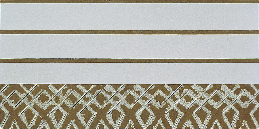
I've been using masonite since about 1958. At one point I was using canvas but I had a slight disaster. Somebody sawed through one of my paintings one day and I swore that it would never happen again so I use masonite. Sometimes I use the raw masonite as part of my paintings. I just keep it raw or in some cases where I want to go darker, I keep staining it with linseed oil. I started to do that simply because I was painting one day and I noticed that one of my colours was bleeding out into the masonite. It looked dark, and well, why not? I am willing to respond to accidents in my painting. They're not all uptight. A friend of mine said, Jesus, Bloore, what happened? Did you run out of paint? Nobody is going to pay good money like that for a big chunk of bare masonite. I think he’s right. No one has.(3)
↑ ↓ ↑ ↓
 |
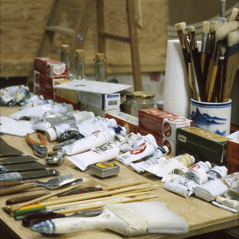 |
1987, November 29, Untitled, 112x224 cm, University of Regina, and ”about thirty whites“
How do I put the paint on? On the whole, I tend to use paint scraping knives, anywhere from an inch wide up to about six inches. I use a lot of tape. God, how did people paint before masking tape, geo-tape, came along? I'll never know. Currently, I’m using a lot of scratchy surfaces, and those are the result of spreading the paint around with Japanese chopsticks. The Japanese ones are preferable to the Chinese. The Japanese taper a little bit and are pretty tough. You'll note that the two tools I'm primarily using, paint scraping tools and Japanese chop-sticks, are cheap and practically last forever, unlike brushes which wear out very very rapidly.
I've got about thirty whites that I would normally have on my studio table at any one particular point in time. The titanium white made by Winsor Newton is vastly different from the tit white made by Lefranc & Bourgeois, which is distinct from the titanium white made by Grumbacher, et cetera. So I tend to buy whites of all these various companies. Not only are they slightly different in hue, they are different in consistency and they are different in drying. Permalba white seems to be the whitest of whites so far that I found. Some of them are quite creamy. Those are on the whole flake white based paints. Some are blue, quite bluish, in appearance. Those are always zinc whites. Lefranc & Bourgeois had a paint at one time which looked to me absolutely green. I suppose to most people it would look white because the tube said it was white. I thought this is absolutely marvellous. I sent my assistant out desperately fast for more. That must have been a bad batch for Lefranc & Bourgeois because I only had a few tubes of it. It was too bad. I've run out now.
I use a lot of so-called quick drying underpainting whites. The underpainting white of Winsor Newton is an absolute grey. The underpainting white of Talens will become a very cream colour, a very warm colour. And so it goes. You get the flake white of Lefranc & Bourgeois and keep it out of the light for a period of time, it actually comes out a beautiful golden pancake colour. Although people think I’m using white and all my tubes say white, if one looks around I’m absolutely working with various hues or various tones. When painting though, I have to keep a chart because sometimes you can’t see them right away, or if your eyes are a little tired, you can make a mistake and pick up the wrong white and put it on. I've done that in the past.
↑ ↓ ↑ ↓
One Big Painting
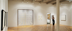
The diptych format was developed out of a need to work larger and, being limited by the size of masonite, you do two. In actual fact, there is one in here, in storage, a five-panel job [now in the AGO]. What I plan to do now is one painting which runs all the way around this studio which I think is something like sixty-five or sixty feet long. I might just as well have fun while I'm in this space. Some of the diptychs are framed as one great eight-by-eight painting. If I frame them in here that size I can't get them out, I’ve discovered. That’s like making the boat in the basement, then can’t get it out. I've done that with one of these paintings. Others are framed separately with a little space between them.
 |
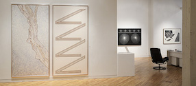 |
8-by-8's at the Moore Gallery in 2011, No.12 in one frame and on the right the diptych No.28
which appears laying flat on the two tables in the studio photo up above on the left.
I feel good about the diptych. It’s just a little larger. I'm in a large studio for the first time in my life and I think automatically the paintings got larger. You know the Attila Lukas paintings? I mean they're a decent size. A lot of people say you're painting so big, nobody’s going to buy them. Well fine, I've got a lot of smaller ones around too. Granted, they don’t fit over the fireplace but a lot of people don’t have fireplaces these days. I’m not worried about it. Oh sure, I can’t even put one of these in my own house, but so what. I want to look at them. I want to see, always, what the next one is going to look like. That's important. I just want to get onto the next one. It's just one fantastic continuity.
↑ ↓ ↑ ↓
Cimabue, Giotto, Miro
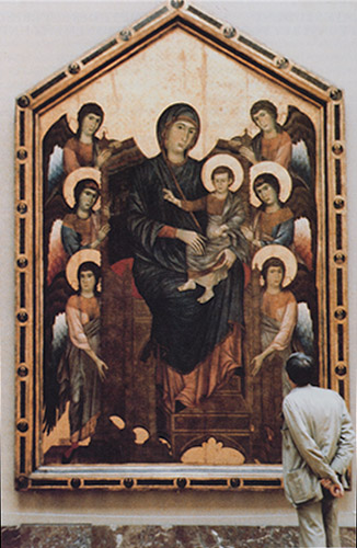
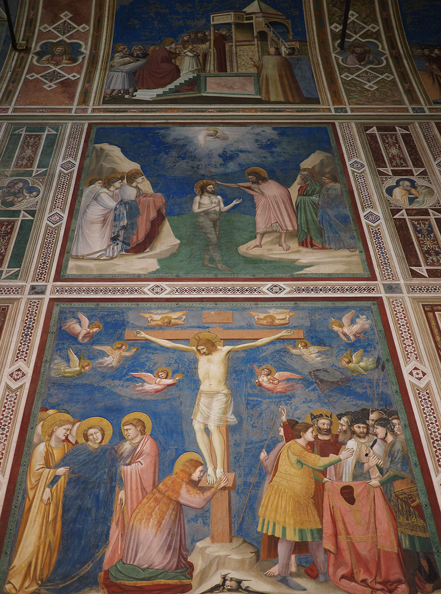
Giotto blew it, and you can spell blew, b-l-u-e or b-l-e-w. There is a photograph my daughter took of me standing in the Louvre looking at the Cimabue Madonna and Child and Angels. I consider that to be: Bloore looking at the last great painting of the western world. That tends to shock people. I remember one day [Doug] Morton said, Come on, Bloore, that’s nothing, Miro said all art since the Paleolithic has been decadent. Holy Jesus, that really does eliminate an awful lot. I spent ages and a hell of a lot of money buying books on Miro to try to find out if Morton was right and yes, that is what Miro had said at one point in time.
 |
 |
The most striking thing for me about Byzantine art is that you have to go and see it. It's all there in the public places and all on the inside. On the whole, the exteriors of Byzantine buildings look like barns. But once you step inside, you've in actual fact stepped into heaven. It’s a great and imaginative world.
It would be lots of fun to trace out the disappearance of the landscape from late Hellenistic and Roman art through early Christian, early Byzantine and Byzantine art. The landscape absolutely slowly disappears completely and in whole process of that, the sky is no longer blue; the sky becomes gold. I like a guy who can give me the imagination to think that the sky is gold. Gold. I don't want Giotto to tell me the sky is blue. I mean this is an insult to my intelligence. I go outside and I see under normal circumstances the sky looks blue. I don’t need that. I don’t need somebody to replicate my daily experience. But when I see the Byzantine material... I remember in Mon Reale, I spent all day there, except for lunchtime when they kicked me out. You could see these great gold things and sometimes you could only see the gold. You couldn't see the figures any more. The figures all go black and you just get great golden shapes. The light changes slightly as the earth rotates and sometimes you could see all the figures and all the gold became black. It's a whole miraculous thing, totally involving. Visually it's totally fascinating. It’s rather a shock for a Canadian to get very excited to see the disappearance of a landscape. It’s just a point of view.
↑ ↓ ↑ ↓

Isfahan by Bloore |

Bloore in Isfahan |
I went for about a week to what I heard was considered to be the most beautiful city in the world, Isfahan, which is an oasis city southwest of Tehran. I've heard it was shelled, attacked by missiles during the Iran / Iraqi war. I hope not. Everyday I'd go out as my wife was getting up, getting prepared to face another day in this exotic city. And I'd come back and say, Jeez you know, that mosque, whatever, that was nothing. I’ve found another one. You ought to see this one. Come on, come out and take a look at this one. Fantastic. Next day I'd go out again and say, What you saw yesterday, I apologize. That was a piece of garbage. This happened all week and finally I came back one day. Where have you been? And I said, I've been in the Heart of God. It was a little wee mosque insofar as you would walk in on an angle and turn. It was very small. You go inside and the dome of it, decorated the traditional way, was practically pulsating. Glorious blue, gold, white. By the way, it was all marvellously non-figurative, except for the Arabic inscriptions from the Koran. Art can be very moving at times — not too many times. The more you get up off your ass and travel and see, the less you like, but what you do like is incredible, an intense experience. You really become proud at times that you’re a human being and by God, humans have made that. You can go to Chartres Cathedral and say, My God, men actually did that and then you go home and take a look at your own stuff and say, Jesus, you know. It's like after I spent five weeks in Egypt, I went back and just destroyed everything I'd done - rather overwhelmed by the whole thing. But then you recognize the fact that you do what you can do. It’s worthwhile doing it even if you're only maintaining the idea that it is important for man to make visual images.
↑ ↓ ↑ ↓
Art and Politics
I just got back from Paris and I saw a lot of impressionist paintings and people looking at those things. My God, aren't they wonderful. I mean, they are a little sweet, a little nauseating, at least for me at this end of this particular century. But who began to buy them? This beautiful picture-postcard view of the world. All the rich American capitalists began to buy them. This is the world they want to see. This is the world they want to put in museums. This is the world they want their names attached to. Whereas, as you know, those guys for a fair amount of time were having a pretty rough go of it. I still don’t know how you can paint those beautiful pictures of the world and worry about where your paint is going to come from. Those in turn have their own political statement and are also used politically.
The one closer to home is that of Kleinberg, that great Valhalla to the Group of Seven. They are honoured and they were collected by an incredibly rich guy. Now what were these people trying to do? This is interesting. The Group of Seven had a political agenda and that was to make Canadians love their country. Even Mulroney can’t make us do that. No one has been able to do it. Even Stompin’ Tom can only work in English Canada. The Group of Seven had this political agenda of making Canadians recognize the soul of the country and the soul of the country is going to be the northland. Barren, just trees, fall or spring, that sort of thing, and just landscape going on and on and on, with no one in it. The French Canadians have never seen their soul that way. But at Kleinberg, you see, the works were put together, collected by a rich man. And then other collectors of the Group of Seven could begin to donate works to Kleinberg with nice tax deductions, et cetera. So now school kids are brought in hideous yellow buses in droves to see, as it were, the soul of Canada. This landscape which is a late nineteenth, early twentieth idea. I have to say late nineteenth and early twentieth century on the basis that they were working out of a European landscape tradition which was already defunct in Europe. It no longer had any viability.
Those guys really did have a political agenda, just as Paul-Emile Borduas had a political agenda and a social agenda and a religious agenda in Quebec in the late 1940s. He, after all, with his paintings and the Refus Global, fired essentially the first shot in the Quebec Revolution. Here he managed to have artists, painters, sculptors, critics, dancers around him who really recognized what was wrong with their culture. French Canadians were able to use, and still do use, culture, the artists, the singers, the poets, the novelists, as part of their political agenda to change their culture and their society. And the artist in French Canada has a status, a stature, that we don’t have in English Canada. We are used by the corporate elite, at times for their own end, really exploited by them. It’s quite a difference. There are two cultures, vastly different in their attitudes towards the artist.
↑ ↓ ↑ ↓
Art and Censorship
My wife was convicted by her majesty the Queen's courts, the Supreme Court of Canada, for exhibiting obscene art. That was a very difficult thing, from the sixties. She put on an exhibition which included Bob Markle, the late Bob Markle unfortunately. And someone complained to the police, the morality squad, that this exhibition, Eros 64 or whatever it was, has filthy pictures in it. The morality squad went and said, My God, these are filthy pictures, and rolled their eyes up to heaven and said, You're under arrest. They said, Take these pictures down. She was sort of dramatic and said, Over my dead body. So they didn’t come down so she was hauled off. Interesting thing: An anonymous phone call can send out the morality squad. It went up to court. Bob Markle was in there. That got really touchy because I think in court the implications were lesbianism but you couldn’t say that in open court. You would have to allude to it. So she was convicted and was in provincial court and so on. I really think she should have been convicted for putting on a very bad exhibition. Can you imagine, Eugene, what kind of erotic images Anglo-Canadians could dream up in the sixties? Not very much, I mean, really.
The other person of course who had difficulty was Mark Prent with Av Isaacs. I am fairly convinced though, in the long run, the initial attack - because there were things handed out on the street — which tended to suggest that the white suprematists were attacking that particular show. After all, Prent is Jewish, Av Isaacs is Jewish, and this was attacking the sacred standards of Western art. OK, the Prent stuff was Prent stuff. It had its shock value but I can walk down the street and be shocked. In fact, while the first show of Prent’s was on, Straw Dogs, I think that was the name of the movie, was on at the Uptown. It was infinitely more violent, horrific, terrifying, obscene, if you want to use that word, than the Prent show. After all, the Prent stuff wasn’t moving around, flashing images in front of your eyes. You were there. You could stand, look at them or walk away from them. What happened there, I think, was some people, prestigious collectors, came down and bought some of these works. It was very embarrassing. Prent was attacked not for obscenity but for disgusting objects. Prickles. Prickles. In pickle jars are prickles. I mean there was a kind of marvellous macabre humour there, coupled with his fantastic technical ability. Joe Green had the entire show transported up to York University and it was put on there. They had a symposium about this. Prent was there and so on. And they invited the Toronto chief of police whose squad was laying the charges for the disgusting in a public forum in a public space, with a lot of young people around, and the chief of police didn’t come. Well, who are they going to charge at a university? You have to charge the highest officer, who is appointed by the government, that is the chancellor.
I can’t go for censorship. Period. At all. Societal values change. If you want to begin censorship, you can end like the Catholic church in the seventeenth century, burning people at the stake for failure to believe the same thing. People can be given the opportunity in certain things we do prohibit like murder, like theft, and so on. Kidnapping. Oh, I think that we artists are quite responsible people.
↑ ↓ ↑ ↓
Art and Science — Art and Technology
In my other studio I had this marvellous poster. It was about photography in the nineteenth century and the title of the exhibition was From this Moment On Painting is Dead. Fine, yet it keeps going on and on. Because we've got these new technologies doesn’t mean that Picasso couldn’t use bronze to cast some of his sculpture in. We keep what we need out of the old technologies. It’s just an opening up; there are more opportunities, more directions, because this is worse than a schizophrenic society. We don’t know what we are doing anyways. We have no coherent vision of our own times or even the recent past and certainly we have no vision of where we think we might be going. We have no stabilizing influences within our culture so therefore we have this whole range of possibilities, this whole range of freedoms being given. Some can be exploited successfully; some can’t be exploited successfully.
Who are the really great men? Let's take the Renaissance. I think that during the Renaissance the guys who were really intelligent became artists. That was the one area within their culture that could really be opened up. It was explosive. This new way of looking, thinking, responding, measuring, viewing, interpreting the world around them. It seems to me that the most intelligent guys were artists. Look what they did, a kind of explosion of this world, we know it as the western world. I think the bright guys today will go into science because that is another world. If you begin to read the cosmologists, people like Hawking, et cetera, it's absolutely marvellous because these guys get together, they don’t know, they stand up to argue, they have funny names for each other. I was reading an article in the Scientific American about a meeting of cosmologists up in Sweden. Those guys are really marvellous in their thinking, in their searching, in their desire. It's the same kind of thing. We know today we're in a vast universe, My God, they’ve just discovered another universe out there. I don’t know how they do it but they figure there are a hundred trillion stars out there. I tried the other day to write down a hundred trillion while sitting at my desk. I didn’t know how to do it. There is a world of imagination.
↑ ↓ ↑ ↓
Note 1
In 1990 the MacKenzie Gallery, Ron's old gallery, in Regina organized the very large retrospective called Not Without Design which included many very large paintings, indeed climaxed with a number of the latest
8-foot by 8-foot diptyches. It took up most of the gallery and it took up most of each of the five major galleries it travelled to. But the three galleries in the country larger than the Mackenzie (rather predictably you might say) would not be persuaded to host the show. (back)
Note 2
The Coloured Works page, here, is devoted to Bloore's complicated relationship with colour.
(back)

Claude, Eugene and Ron out sunday sketching in 1989.
There is
a Breeze and a Knapik
on the
Difficult Art Collector page.
Note 3
The emergence of uncovered masonite in Bloore's paintings was a main focus of his second public gallery retrospective held by the Art Gallery of Peterborough in 2005. It is featured on the site here. (back)